


An extensive array of books, articles, “how-to” manuals, and websites abound with tips for preparing effective slideware presentations. Yet, even a cursory and unsystematic examination of presentations at political science conferences confirms that the advice often goes unheeded. With a looming deadline to submit a completed paper before a meeting, coupled with the short duration of the actual presentation and perhaps low levels of digital fluency, many presenters devote limited time and effort to creating slide decks. Panelists frequently copy and paste text, tables, and figures directly from their paper into slides, leading to rudimentary mistakes that are less than ideal for optimally conveying their research. Indeed, the importance of slideware presentations often is underestimated and principles of design and aesthetics are neglected.Footnote 1 We offer 10 tips for creating cleaner, more visually appealing, and memorable presentations. Although we focus on slideware for conferences, these suggestions also can be applied to job talks and teaching.
IMPORTANCE OF GOOD SLIDEWARE
In a world with smartphones and social media, audiences are accustomed to visual aids, thereby reinforcing the importance of creating polished slide decks. Slideware provides visual cues, organizes ideas in a clear manner, and enables pacing to ensure that presenters finish within their allotted time. Excellent conference presentations may help to publicize presenters’ research and build their professional reputation, leading to a variety of professional “plums,” including publishing opportunities, speaking engagements, and job interviews. Conversely, good research ideas might be lost in a poorly conceptualized and designed presentation.
Opinions concerning slideware appear divided. Critics (Schwartz Reference Schwartz2003; Thompson Reference Thompson2003; Tufte Reference Thompson2003) claim that slideware is merely “bells and whistles” that “promotes simplistic thinking,” reduces complex ideas, mutilates data, and winnows research into tiny sound bites. Even Hassner (Reference Hassner2005), an advocate of slideware, warns about the disadvantages of fitting lengthy and complex arguments into a presentation, overusing visual effects, and bulleting incorrectly. Design expert Tufte (Reference Tufte2003, 4) contends that PowerPoint results in “low spatial resolution, a deeply hierarchical single-path structure as the model for organizing every type of content, breaking up narrative and data into slides and minimal fragments, rapid temporal sequencing of thin information.” Instead, he encourages scholars to abandon slideware entirely in favor of a single piece of paper (Tufte Reference Tufte2003).
Proponents, however, contend that slideware provides an opportunity to create dynamic presentations that engage audiences (Hassner Reference Hassner2005; Salmond and Smith Reference Smith and Salmond2011). Smith and Salmond (Reference Smith and Salmond2011) underline content, organization, and timing, whereas Hassner (Reference Hassner2005) suggests that slideware helps political scientists present linear arguments, limiting the amount of information conveyed. These scholars address design but tend to gloss over aesthetics. Indeed, changing trends and advances in software, instructional design, and human–computer interactions demand that we adapt or risk losing slideware as an important communication tool.
10 TIPS TO CREATING BETTER SLIDES
Building on Salmond and Smith’s (Reference Salmond and Smith2011) and Kastellec and Leoni’s (Reference Kastellec and Leoni2007) work, we offer the following 10 tips focusing on slide design and aesthetics to improve the quality and effectiveness of presentations.
Tip #1: Keep It Short and Simple (KISS)
In an effort to be thorough, presenters often include too much of their paper in a slide deck mistakenly believing that the audience will absorb everything. This results in too much material in too little time, and it poses a potential cognitive overload because of our limited capacity to process information quickly (Sweller Reference Sweller1988). Therefore, avoid too many concepts on each slide. Content always precedes design. First ask: What is the main message or key findings that you want the audience to remember? Assuming each panelist is allocated 15 minutes, some individuals adhere to the principle “one slide per minute.” The 10-20-30 rule allots 10 slides for a 20-minute presentation using 30-point font (Kawasaki Reference Kawasaki2005). We recommend a total of 10 to 15 slides with approximately half to one-third devoted to findings (figure 1).
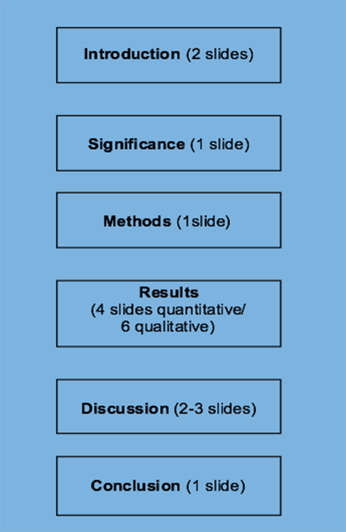
Figure 1 Organizing Slides for a 15-Minute Presentation
Think about each slide’s goal, purpose, and function, weighing the utility of each component within a slide. Unlike decoration, design has a clear purpose devoid of extraneous clutter. With the flexibility to add any number of colors, backgrounds, fonts, borders, images, and other decorative elements, decide what purpose they serve. Borders create uniformity and cohesiveness (Cote Reference Cote2013) while also anchoring content and directing the eye to differentiate between the title and what appears below it (figure 2). To reduce intrinsic cognitive load arising due to complex materials, introduce ideas one at a time so that they are easily understood and retained (Sweller Reference Sweller1988). Use “chunking” to split and better organize information into related bite-sized pieces, gradually connecting ideas (figure 2). Adhere to the “less is more” principle and always keep in mind the KISS rule: Keep It Short and Simple.
Figure 2 Chunking and Incorporating Images Illustrating the F-Formation
Tip #2: The “6 x 6” Rule
Including too much information on a slide is a common mistake that may result in an audience losing or shifting focus. To increase cognition, approximately one-third of a slide should encompass “white space” or “negative space” with no text or images (Berinato Reference Berinato2016; Shannon Reference Shannon1951). This powerful technique “gives the key elements more breathing room” and emphasizes the main points while also providing an element of contrast, which is a vital design component (Schelle Reference Schelle2016). Limit text to only what is essential by following the 6 x 6 rule: six lines per slide, six words per line, and no more than 30 to 36 words per slide (figure 3) (Paradi Reference Paradi2012). Instead of complete sentences, use single words or short phrases to capture important points—boldfacing key words—so the audience can process information quickly. However, this rule can be relaxed for qualitative data using full quotations (see Tip #9). Long research questions should be distilled into smaller subparts to facilitate clarity and numbered hierarchically (figure 4).

Figure 3 Communicating Succinctly Using the KISS and the “6 x 6” Rule
Figure 4 Numbering Hierarchical Information
Tip #3: Consistency, Consistency, Consistency
A common flaw with many slide decks is the absence of visual consistency, which is necessary for maintaining predictability and contributing to retention (Lidwell, Holden, and Butler Reference Lidwell, Holden and Butler2010). Use a template with a minimalist design, along with the same placement of text, font, size, color, capitalization, and punctuation on each slide to ensure uniformity (figure 4). For example, a presentation on the United Nations might feature the organization’s blue emblem on all slides. Titles should be left- or center-justified and the text below should use the same font and font size (see Tip #7). Capitalize the first word of phrases and bullets to facilitate scanning. Whether to use periods is a conundrum that many presenters face, and this is largely personal preference. Whatever you choose, be consistent.
Tip #4: Size Matters
Presenters often are unaware of what font size to use for text, graphs, charts, and tables. For example, tables with too much data and fonts that are too small are generally indecipherable to an audience, irrespective of any visual impairment. Titles should be in 32- to 44-point font and other text should be no smaller than 28-point (Dyson and Suen Reference Dyson and Suen2016). Visuals must be sufficiently large to be read at a distance, but what constitutes large enough? Graphic displays should occupy slightly more than three-quarters of a slide; however, be sure to maintain enough white space around them (Schelle Reference Schelle2016). For graphs, the x/y axis should be 18- or 20-point without reducing the clarity of the component parts (Berinato Reference Berinato2016). Generally, the bigger the better when it comes to font and images.
Tip #5: Bullets, Numbers, Both, or Neither?
Eschewing bullet points, Atkinson (Reference Atkinson2011) argues that they are unnecessary and create a stiff, formal environment. Whereas it might be appropriate to forego bullets altogether, doing so presents a formidable challenge regarding how this might be executed. In addition to organizing and grouping ideas along with maintaining uniformity (Paradi Reference Paradi2012), numbers and bullets transform complex sentences into vertical lists that are easier to scan (see Tip #7). It is appropriate to number research questions, procedural steps, and lists because they follow a logical narrative (see figure 4). Bullets should correspond to font size and begin with a noun or active-voice verb, maintaining the same syntactical structure. Be sure to select bullets and not hyphens, which are used to punctuate compound words and connote mathematical operations. Use solid- or hollow-square bullets rather than round ones to create white space and provide better contrast with the text that follows (see figure 2). According to the 6 x 6 rule, use approximately six bullets per slide; otherwise, the slide becomes text-heavy. Avoid “sub-bulleting” in which two sets of bullets of different types, colors, and fonts are used to convey hierarchical information (figure 5).
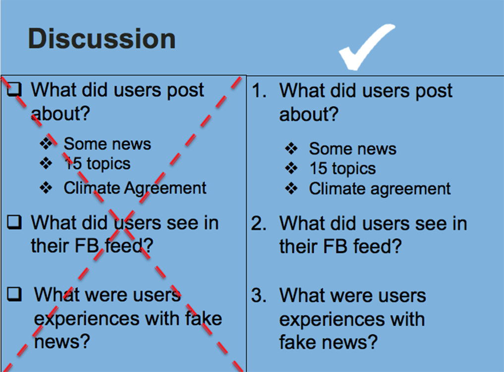
Figure 5 Redesigning a Slide to Avoid “Sub-Bulleting”
Tip #6: Color Me Beautiful
Color wields an immense power on an audience, often evoking an emotional response. Therefore, use it strategically, consistently, and carefully. Choose a template with a theme that contains one or two colors to reduce visual clutter and to provide contrast for people with disabilities (see Tip #10). Consider template designs with vertical or horizontal lines, and avoid busy backgrounds with waves, circles, uneven color, and faded effects that detract from text and images. If not using a template, choose solid rather than gradient backgrounds (e.g., a light-blue background and a dark font). Once projected on a screen, certain colors translate better than others. White slides may compete with room lighting and windows, creating a harsh visual effect, whereas a black background with white or light-colored fonts or objects can create a glow making it difficult to read (Duarte Reference Duarte2008). According to color theorists, blue and purple are the most preferred colors and they accommodate visual impairments. Avoid browns, yellows, oranges, and reds because selecting an appropriate contrasting font color is problematic (O’Donovan, Agarwala, and Hertzmann Reference O’Donovan, Agarwala and Hertzmann2011). The same applies to obscure colors such as puce and chartreuse, which can obfuscate rather than elucidate.
A small range of colors—two or three—is preferable when making tables, graphs, and charts to aid an audience’s visual interpretation. For example, a bar chart illustrating characteristics of the Democratic and Republican parties might use the conventional blue and red, respectively; however, be cognizant of color selection (see Tip #10 to accommodate disabilities). Although it is tempting to use blue and pink to represent gender, this reinforces heteronormative assumptions; consider using other contrasting colors. If using gray for graphs and charts, be sure that the shades offer sufficient contrast (Okabe and Ito Reference Okabe and Ito2002). Finally, because slides appear in quick succession and the audience may not have time to distinguish among categories, use dissimilar patterns.
Tip #7: A Picture (or a Video) Is Worth a Thousand Words
Because presentations typically emerge from papers, there is a tendency to include too much text, which increases cognitive load. Research indicates that individuals are more likely to remember information that is accompanied by a picture than without one (Medina Reference Medina2014). Replace text with a visual metaphor or high-quality images that connect with the audience emotionally or intellectually (see figure 2) (Kernbach, Eppler, and Bresciani Reference Kernbach, Eppler and Bresciani2015; Salmond and Smith Reference Smith and Salmond2011; Sweller Reference Sweller1988). For example, comparative research could include maps and a presentation about migrant laborers could include a picture—but avoid clichés. When possible, include photographs you have taken or, if relying on stock images, find innovative ways to use them; slight modifications can make a big difference (figure 6). Because of copyright laws, use only licensed photographs or those in the public domain (e.g., Creative Commons). Including interactive features such as video clips, music, and animation can provide dramatic effect by underlining a particular point or tying a presentation together. However, do so sparingly and exercise caution considering time limits and room logistics.
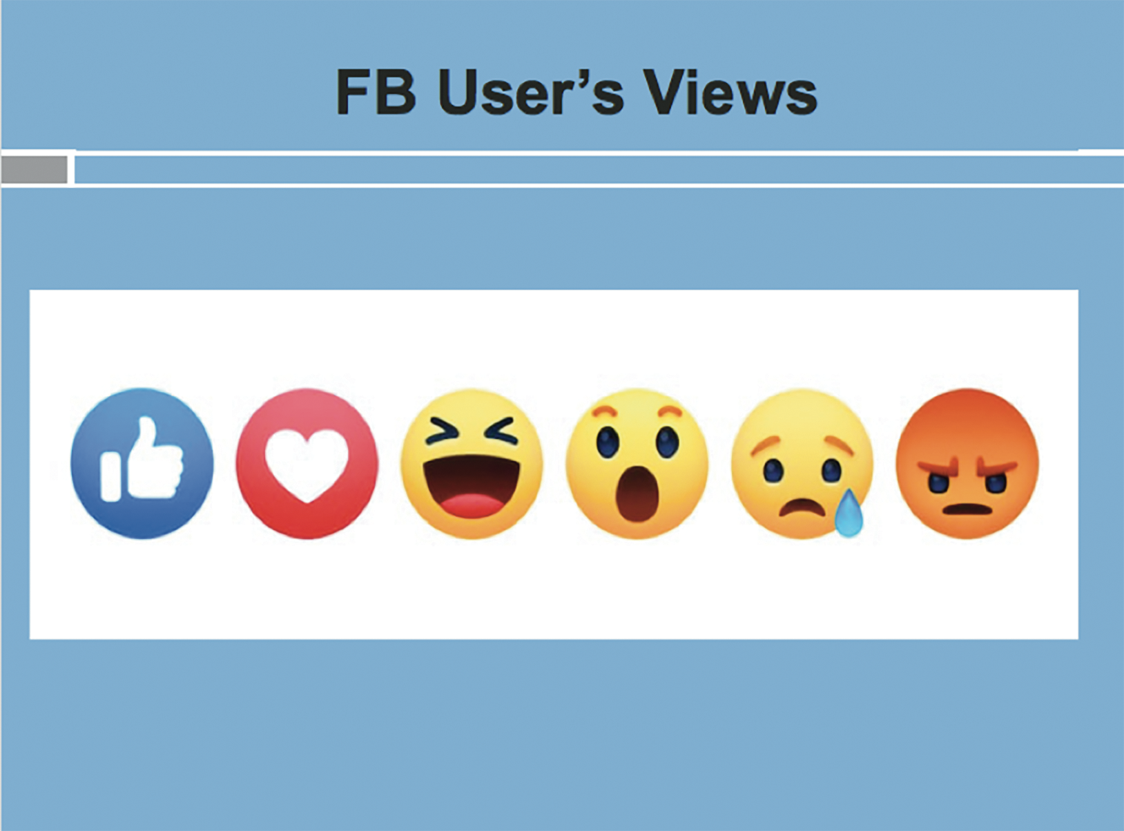
Figure 6 Incorporating Images with Minimalist Design
When incorporating images, place text on the left half and images on the right half of a slide (see figure 2); eye-tracking studies show that readers scan content in the pattern of the letter “F” (Nielsen Reference Nielsen2006). Put the most important information in the first few lines but do not ignore the lower section of the slide. Select high-resolution images to enable resizing without pixilation and avoid stretching, which creates distortion. Maintain the image’s proportion by using the crop function. Maximize the data–ink ratio (Tufte Reference Tufte2003) by removing extraneous or redundant design details (e.g., borders, gridlines, special effects, boldfacing, and extra labels) without compromising the data being presented. For example, two- rather than three-dimensional images and figures are concise, easier to comprehend, and—depending on depth of perception—more accurate, especially for accommodating disabilities.
Tip #8: Presenting Quantitative Data
When displaying quantitative data, too often presenters paste a table into a slide that an audience cannot comprehend. Reduce the cognitive load by “thinking and then inking.” Because the brain processes images 60,000 times faster than text, and 90% of the information sent to the brain is visual (Vogel, Dickson, and Lehman Reference Vogel, Dickson and Lehman1986), opt for spatial tools such as graphs, charts, and images whenever possible (Kastellec and Leoni Reference Kastellec and Leoni2007). Simplify dense tables into smaller bites. Given time limits, display only those results that are statistically significant and verbalize those that are not.
A two-dimensional approach prevents distorted visuals and reduces the data–ink ratio. Pie and donut charts (with two or three slices) and bar graphs (with six or fewer bars) are ideal for nominal and ordinal variables, whereas histograms and line graphs are used for interval ratio data (figure 7). Use bar and line graphs with vivid contrasting colors or patterns for comparison (see Tip #6). Consider collapsing similar categories (e.g., extremely satisfied and highly satisfied = satisfied) but be cognizant of losing detail at the expense of simplicity. When creating a pie chart, pop out an important slice to highlight it. In charts, remove superfluous gridlines; line graphs should use a maximum of three or four thick lines to ensure visibility. Include a clear descriptive title and leave adequate negative space on the slide, whether in the graphs or margins, to accommodate individuals with disabilities (Okabe and Ito Reference Okabe and Ito2002). Substitute legends with data labels and display them horizontally to improve readability using at least an 18-point font. Always include the data source beneath tables, graphs, and charts.

Figure 7 Maximizing Data–Ink Ratio in a Bar Graph
Convert regression results to a table with positive and negative signs indicating the direction of the relationship (figure 8); use asterisks or color-coded cells to denote statistical significance. Alternatively, generate a colored bar graph to depict the direction and magnitude of the coefficients or create a plot with error bars (Kastellec and Leoni Reference Kastellec and Leoni2007). Remember the 6 x 6 rule and exclude unimportant results. To tell a compelling story with data, do not overwhelm the audience with an avalanche of numbers. Intersperse key findings or images between slides that display data to reduce extraneous cognitive load.

Figure 8 Presenting Regression Results Without Coefficients
Tip #9: Qualitative Data: To Quote or Not to Quote?
Displaying qualitative data can be challenging because it requires winnowing text into digestible bites. Experimental studies indicate that reading a text-heavy slide while simultaneously listening to the presenter uses similar structures in the brain, leading to neural competition, cognitive overload, and reduced retention (Horvath Reference Horvath2014). To minimize task switching, use one word, a phrase, a word cloud, and images whenever possible. To ensure sufficient negative space along with an adequately sized font, avoid quotations of more than six lines. For longer quotations, use a visual metaphor or select a related image and read the quotation (Bekker and Clark Reference Bekker and Clark2018). For example, an interview quote from Nelson Mandela might incorporate his photograph. Alternatively, reading the quotation while showing a solid gray slide with no text reduces distractions and draws the audience’s attention to the spoken words. For longer block quotations, highlight keywords in boldface but do not change the font color (figure 9). Shorter quotations are displayed effectively on slides when double spaced (increasing white space), 28-point font, and center-justified. To draw attention to the quotation and give it definition, use a text bubble or its equivalent. Finally, juxtapose two different fonts to effectively highlight contrasting or dissimilar views (figure 10) (Okabe and Ito Reference Okabe and Ito2002).

Figure 9 Displaying a Long Quotation, Highlighting Key Ideas

Figure 10 Illustrating Contrasting Views with Different Fonts
Tip #10: Accessibility
Ensuring that slideware is inclusive for individuals with disabilities remains underexplored. Globally, 8% of men and 0.5% of women are red-green colorblind, with many people unable to distinguish between pure red or green and certain ranges of colors (e.g., between yellow and light green). Attention to visual coding—that is, the ability for information to be processed visually—is essential whether background, font, or images. Opt for vermillion or magenta instead of red and bluish-green instead of green (Okabe and Ito Reference Okabe and Ito2002). Use the grayscale feature to ensure that colors and graphics provide sufficient contrast and tools such as Vischeck to review presentations from the vantage point of color-deficit individuals.
Formatting and fonts also require thought. Use redundant visual coding as an antidote to heavy reliance on color to communicate. Use patterns, shapes, and other markers along with positioning and hierarchy (Okabe and Ito Reference Okabe and Ito2002). Ensure that lines in graphs are thick, chart objects and symbols are large, and font size is greater than 28-point. Include symbols such as a checkmark for yes and an X for no. Animations should be simple or not used at all because swirling text can pose a challenge to those with dyslexia. The same is true for serif fonts such as Times New Roman and Palatino. Instead, use streamlined sans-serif fonts such as Arial, Helvetica, and Gill Sans typefaces with lower “visual noise” (Dyson and Suen Reference Dyson and Suen2016).
If the presentation is being shared via email or uploaded to a website, a few additional steps are necessary. All images must include a description using the “alternative (alt) text for all images” feature. This requires users to right click on an image, insert text of fewer than 140 characters, and introduce it sequentially. Hyperlinks should be renamed rather than providing a URL. Finally, convert slideware to a pdf to ensure accessibility.
CONCLUSION
Visually communicating an argument and results is more important now than ever before. Although political scientists are far behind industry standards in terms of our presentation skills, we can and must do better. Great presentations contain slides with few words, bold images, and complementary colors and are easy to read. Used adroitly, graphs and charts aptly highlight quantitative data and images illustrate qualitative data. Above all, clearly conveying the core argument and/or results in an aesthetically pleasing yet minimalist manner is not only crucial but also paramount. Indeed, no one could have articulated it better than Antoine de Saint-Exupery (Reference de Saint-Exupery, Galantière and Gilbert1939/1984): “Perfection is achieved, not when there is nothing more to add, but when there is nothing left to take away.”


